Friday, October 28, 2016

Radical Pink

Radical Pink, squares playing with gingham check


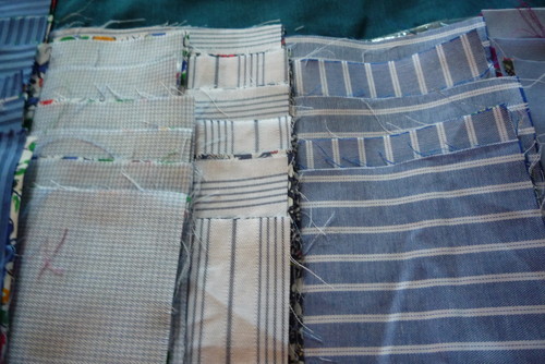
Sometimes fabrics end up together as sheer happenstance.  It’s up to us to notice these happy accidents & make good use of them. 


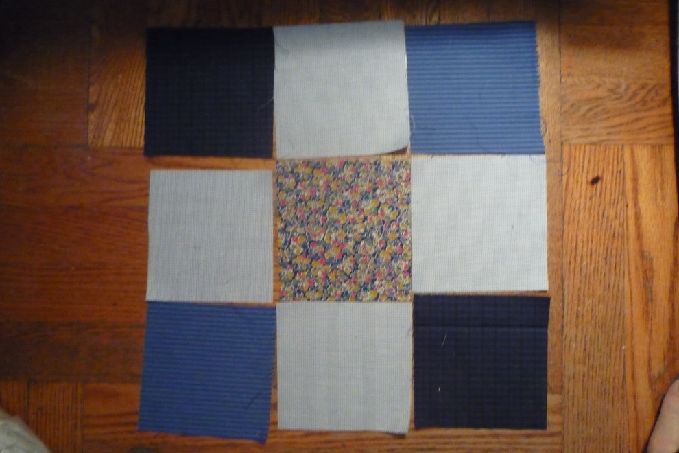
I was coming home from a Quilter’s Guild meeting with a fresh collection of scraps.  One fabric literally fell on top of another & I noticed it & admired the combination.  It was a light gray blue & pink paisley print which fell on top of a pink & white gingham check.  These looked so nice together & I liked the squares motif in combination with a gingham check (a woven).


Sometimes fabrics let you know clearly when they wish to play together; so I tend to give this type of design play wide berth.  It’s invariably productive, even if I don’t know where it’s going at the time.


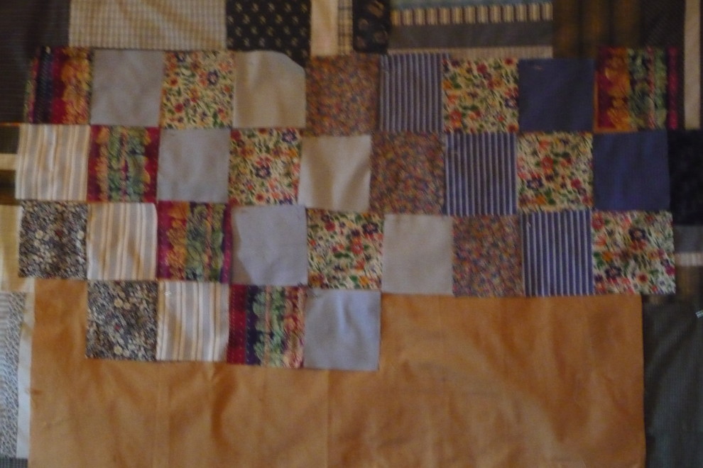
The backing fabric is this beautifully muted pastel wash. At first I thought it a garish print, but after working with it I’d come to realize it was a wonderfully modulated piece. 


Finished off with my favorite binding a reversible one.  This one is a tiny purple print on the front & turquoise blue print on the backside’s binding.


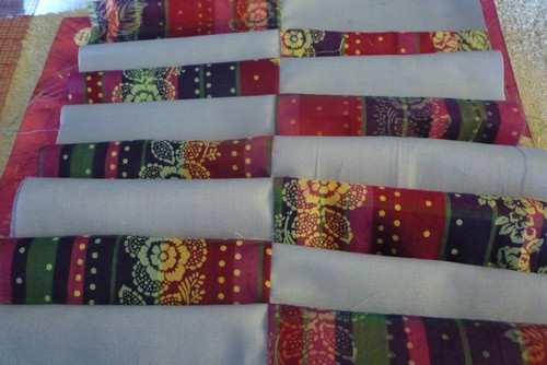
Let’s see if I can post a picture which shows the binding’s two sides.


Turned out to be a nice experiment, I enjoyed it more than I expected.


Sunday, May 22, 2016

Fuschia Liberty & Shirting Friends


These fabrics were given to me at my Quilt Guild by the Service Committee, asking that I do something with them.


This first group is shirtings


The central block here is a Liberty of London print, a finer gauge woven of lighter weight, more finely woven cotton fabric than the Shirtings.

I don’t know that other folks would even Quilt with these materials. But they're donated to our Guild, so recognizing how fortunate that is, I am grateful.

Trying out various arrangements against a Mocha colored piece of Kona cotton.


The Featured Print this Fuchsia colored Liberty print with this cream colored pigment printed overlay.  It's a complex fabric with a woven Indian Madras-type plaid, intensely colored, finely woven cotton.


Just moving the fabrics around, getting used to seeing them together.


In hindsight, after this quilt is done, I can see this kind of design exploration play led me to the checkerboard border around this quilt.


For me, this kind of play is always useful & constructive.


Again, moving things around in the border by sections, I came upon a nice arrangement which transitioned smoothly from one group of colors to another & moved the Viewer's eye around the perimeter of the Quilt.


Next, the back, pieced from a lovely blue print a quilting colleague shared with me, seeing how much better it blended with my project than hers, she offered me the fabric.


Pieced together around a block of the Featured 
Print from the front, with some more checkerboard for good measure; once I made it I liked it & found it fun to use & see.


Here is the Quilt in final form after bindings were put on.  I am very satisfied with this Quilt & how it came out.  I learned a lot doing it & had a good time too, the best of both.


I got a little checkerboard crazy, that alone was fun!


Good fun & so satisfying to see it completed.


Sunday, February 7, 2016

HH Baby Boy Quilt Commission Summer 2015, 2nd BQ commission by Denise

Done using a commercial panel called Urban Zoology. Really fun motifs, I thoroughly enjoyed working on this.

 photo f6b249b2-9492-47d9-8d5f-f4d19eb78315_zpsvsmaconc.jpg

  photo P1120031_zps0qqgsuyz.jpg

Individual blocks, fabrics were charming & good fun.

 photo P1120033_zpsxfqvgllk.jpg  

 photo P1120093_zpsib9q6bvr.jpg

 and

 photo P1120094_zpslkmsibpp.jpg

and


 photo P1120089_zpssg6hk5fu.jpg


A corner inscription block, deliberately askew.


 photo P1120034_zpstwipib3n.jpg

A view of the back, a fun fabric, spotted in the shop by a friend.

 photo P1120164_zpsprxjylle.jpg

On a park bench outside in natural light.

 photo P1120171_zpsoaqeraoc.jpg