Tuesday, March 3, 2009

The Dad Quilt

For Dad,

Someone remarked on how beautiful this looked in photographs, so I thought perhaps I should include it here even though it's rather more personal than most of my work.

I made this quilt for Dad, during his last year when we knew he was sick. Unfortunately, I only got about halfway through it before he died.

We had a coffee theme in our family (having lived for years in Brazil). Dad was the official maker of the coffee with all due care and ritual; he liked it, fussed over it and as we say these days, it was 'his thing'.
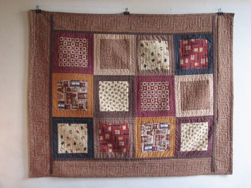
The Dad Quilt

Well, the Fabric House Moda had a collection of coordinated fabrics in a group called “Lotsa Latte” which were novelty prints of a coffee theme. One night at church, after Dad had been diagnosed as terminal and I was later mentioning it to an acquaintance who knew I quilted, she asked ‘so you’re making him a quilt right?’ and I said no, I’m not and suddenly was struck dumb about it.

No, I’m not making him a quilt, why not? Well, ‘cause he was terminal, quilts take time, and who knows much he’s got left. Then shortly thereafter, I was at City Quilter (my local quilt shop, hereinafter “LQS”) and saw the coffee themed novelties of “Lotsa Latte” and thought, Oh I have to make Dad a quilt, a coffee themed quilt, that’d be just perfect and he’d get a kick out of the coffee theme. There were fabrics with mugs and cups; fabrics with old style coffee grinders and several fabrics of coffee beans, one literally that and one stylistically that, along with several other prints which blended well and colored the group beautifully.

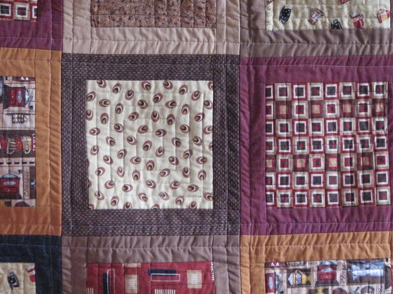
a Close Up Detail
The Dad Quilt

So I bought a prepared grouping of those fabrics (I think a set of 5 fat quarters actually), plus some solids of component colors to blend with. I thought the square within square which came with the grouping was a fabulous print. Actually, if you look at it alone, it really is gorgeous, a very well designed print; it’s balanced, well proportioned, beautifully colored and even though it’s got red in it, could be seen as masculine.

The Back or Reverse Side
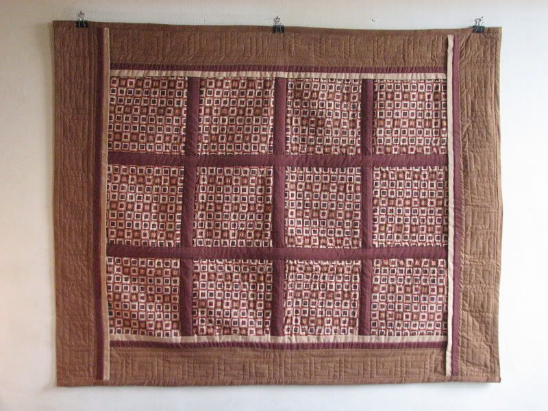
The Dad Quilt

So when Dad died, I stopped working on this, was just too sad. Yet I kept remembering that he would have liked it and determined in my mind that I would complete it in his memory eventually and give it to my StepMom as a touchstone to Dad. I’d always intended this anyway, to give it to her after he’d used it. It’s just that he didn’t get to see it or use it, but my StepMom is a wonderful, loving person and of deep feelings; very good to him and also to us (which as I learned with a prior stepmother was not guaranteed: just ’cause they loved him, didn’t mean necessarily that they’d be good to us). I could imagine her touched to see the love with which the Quilt was made for him and I could envision her (an avid reader) curled up on a big stuffed chair reading under it.

So about a year after he died (just after Memorial Day) I resumed working on it. Between then (the 1st anniversary of his death) and Father’s Day, which seemed fitting enough, I worked on it. Sometimes I was sad working on it, sometimes crying, but always picturing him smiling at the coffee beans and reveling in the idea that I’d made it for him. Took some time and a bit of patience (I hit a technical snag or two). The LQS had run out of the square within square fabric that I was going to use as a solid on the back side. But now Dad was gone, maybe the Quilt could be a tad less masculine, since I was now making it for Barbara, maybe I could use a different border fabric than originally planned. So with Nancy’s help at the LQS, we decided on a light brown crackle fabric for the back borders and I just had to find a quilt design for the borders.

I enjoy making little design jokes with myself, like a play on words except as a play of design riffs, like the Baby Quilt (at the beginning of this Blog) I did called Swirl Play (a play on similar, but related Swirls, of various types and scales). So since the design motif here was a fabric framed by another fabric, it became sort of squares within squares and the similarly themed fabric reinforced that. So I seized on a Greek key design for the borders, sort of squares in squares, related design entities and simple enough that I could draw it onto paper and quilt through the papers which I’d eventually pull off from the quilt.

I think it came out pretty nicely, and someday, I’ll send it with a relative or ship it to Barbara as long as someone is there to photograph her when she opens the package and sees it for the first time. I think she’ll be quite moved and I look forward to seeing her tiny self curled up underneath it. A comforting thought and I can just tell, Dad’s looking down at us smiling.
Monday, March 2, 2009

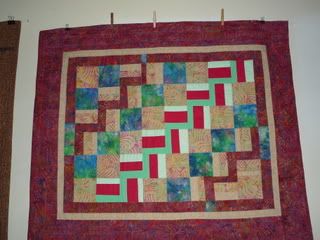
Heliconia Happenstance

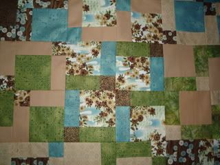
Another recent work completed for a color class taken last year at City Quilter.

The assignment was a split complementary color scheme. Red and green as complements plus blue green and yellow green (those adjacent to the complement). Turned out to be very difficult for me due to the red. I kept trying different things and adding new fabrics to balance with red.

Heliconia Happenstance

The split rail fence motif in red and greens are what reminded me of the heliconia of the title.

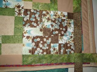
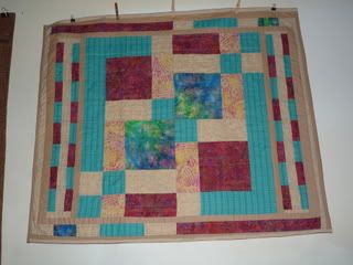
Ultimately, when the front was finished, I moved on to the back eliminating the dreaded red.

I was vastly more comfortable with no bright red and the addition of the turquoise.

Also of interest designwise, is that the back with the teal is one unit of a Disappearing Nine Patch motif, with additional borders to compensate for it being rectangular rather than square.

No More Bright Red, Turquoise Instead

Wednesday, February 11, 2009

Can't Resist Some More - Blame it on my New Camera!

This is a detail of the center panel of the front quilt of the last post with the Green batiks. Its working title is Disappearing 9 Patch (D9P) Orientals.

D9P Orientals center block

One of its corners

D9P Orientals, corner detail

Monday, February 9, 2009

New Camera -- Just Can't Resist Posting


Well this is a work in progress, it's not even quilted yet, just pieced, it's the reverse side (the back) of a Disappearing 9 Patch (DS9). The name has presented itself though given this particular coloring. I call it "Remembering Andes Candies"!


Please ignore the underlying teal work, I just couldn't wait to get started.

Friday, February 6, 2009

A Couple of Very Oldie but Goodies


These two quilts are much older; early enough in my learning to quilt that they each have a poly/cotton blend in them: since I don't wash these that never mattered. This first one, Banners on Point (the gray is the poly/cotton) is the first setting on point that I'd done, was interesting. There's also a mistake or fudging in here as I ran out of one color and had to use a close substitute. I reminded myself that in the weaving of Persian rugs it is said that one mistake is always made deliberately as only G_d is perfect. 


In this one called Rhythmic Stripes, I really like the appearance of movement or rhythm created by the juxtaposition of the direction of the stripes. Funny how things work out, this one is badly sewn, but I think quite effective in its coloration and movement; yields something of a bright and happy effect.


And Now for Something Completely Different, Nissei Africans


Perhaps by now one’s thinking: Well, she shows pretty cool work, but I wonder, can she work in colors schemes other than blues? 

This Quilt is called Nissei Africans because the front is so Japanese in spirit and fabrics. The back however, is entirely different and presented earthy, African feeling fabrics to me. The quilting was machine stitched as outline quilting on the front panels with no regard to how it would appear on the back.


So, here’s the completely different quilt (resulting from an amazing quilting class) which changed my life and certainly the nature of my quilt work, likely now and forever. Importantly, it showed me a technique with which to transition from beautiful but traditional quilt patterns to Art Quilts, unique and one of a kind designs informed by my own lifetime of art and design studies.


Thursday, February 5, 2009

Teal Graphic (after class with Mary Ellen Hopkins)

This is another older but rather fun quilt; I like its high graphic quality. The fact of it being made with a high loft batting (thicker filling, "pouffier", as it were) helps it look 3-dimensional, that effect is bolstered by the particular way I quilted it. Though this is a traditional quilting pattern, the Artist who taught it used a less than traditional manner of assembling it. It went together surprisingly quickly & more easily than it would appear, quite fun.


Funny observation, I didn't realize it until after I'd made this quilt, but each of the five (5) fabrics in it is a botanical print, every single one! To me, it's a funny coincidence as I'm an amateur plant collector, whose collection at times has numbered more than 150 plants (in a Brooklyn studio apartment, no small feat). Even how I chose to quilt the border (the teal/white background print), sort of reminds me of a garden trellis, so it seemed entirely appropriate. 


Then again, nature has always been a huge source of design & color inspiration for artists going back through time. An example that comes to mind are 'toile de jouie', the traditional monochromatic French fabrics featuring pastoral scenes, dating back to the Industrial Revolution which allowed for the first mass production of printed fabrics ('toile' for short).

Wednesday, February 4, 2009

Photo Credits & Blue Thousand Islands

Here's an older quilt which I finally finished last Spring. Happily I got new photographs taken which I feel show it VERY well. 


Unless stated otherwise, all photos here are courtesy of my friend & fellow artist Sage Reynolds, Copyright 2008, with thanks and affection.

Some close ups.

More detail.


This was the first of my quilts to have a colored back (other than say, unbleached muslin as would be the traditional back for a quilt). At the time, it seemed a BIG leap, I was very concerned between two slightly different shades of blue, this hydrangea blue as I called it. 


One slightly more blue purple than the other; of course, a subtlety that only I would see, never mind that it was on the BACK of the quilt.


Minutia I need not have worried about; lesson learned.

Friday, January 30, 2009

AIM: To permit myself to be paid to do what I love!


I start this blog as a marker and first step towards my future making a living from my Quilts and related Textile Design. For years I've heard folks say "follow your bliss". Well this is my bliss: Textiles, Quilts, Pattern and Color, the ingredients to my visual happiness and creative fulfillment and satisfaction. If money can follow along, so much the better. Again today I saw and received the message "permit yourself to be paid to do what you love". Well this is what I love and if not now, when? Perhaps this is why finding the "day job" has been so very difficult, perhaps the Gods wish for me to make this break once and for all.
I post this first picture of my first Baby Quilt, this one called Swirl Play as a hopeful harbinger of the future. It's bright, colorful, happy and playful and may it be a glimpse of things to come: positive, upbeat, bright in both color and sentiment and WIDE open to spontaneity and the future! I am talented enough and I deserve this, after working 30 yrs., I've certainly earned it.


Enough people have commented on my talent and commended me on how beautiful my work is that I really need to do this -- it's scary yes, but I think I just need to take the leap!! Kind of like diving into the ocean, just be brave, hold my nose and jump!